Casualty Dashboard Widgets
Click the link below each image to view additional details about the widget.
Claim Analysis
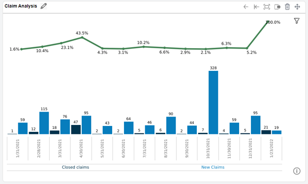
Provides a graphical visualization of the ratio and counts of claims closed during the period versus the count of new claims in the period. Values are displayed in a rolling 13-month period.
 Details about the Claim Analysis widget
The ratio is determined by the number of closed claims divided by new and reopened claims in the period. You can choose to include or exclude claims reopened and closed within the same period.
Hover over a value to view the time frame, new and closed claim counts, and a closed claim duration stratification (i.e., number of claims closed that period that were open for 0-12 months, 12-24 months, etc.).
Click a value to drill down to view individual claim details for the month of activity.
Closed Claims
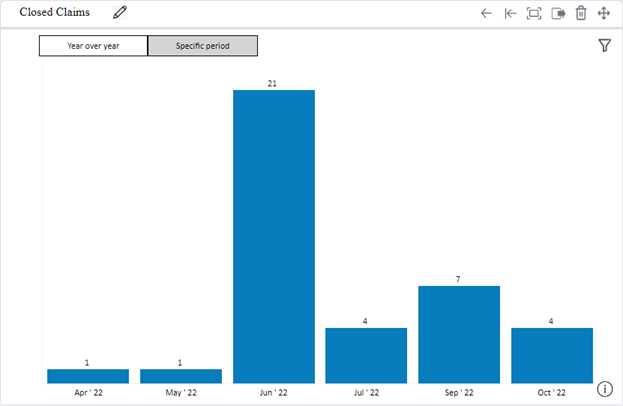
Provides a graphical visualization of claims closed year over year or by month within a specified period.
Details about the Closed Claims widget
Hover over a value to view the average claim duration, total incurred, number of closed claims in the period, date, average incurred, and a closed claim duration stratification (i.e., number of claims closed during the period that were open for 0-12 months, 12-24 months, etc.).
Click a value to drill down to view individual claim details.
Lag Time
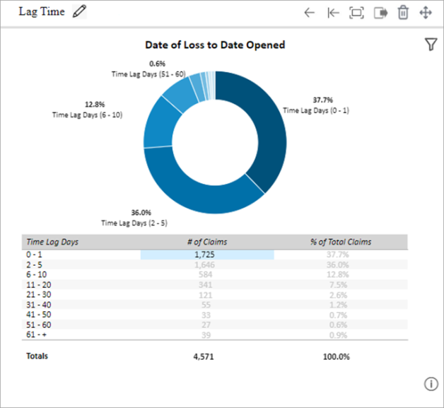
Displays metrics for various claim life cycle lag times.
Details about the Lag Time widget
Select one of the following lag time metrics from the Filter menu’s Lag Time Selection dropdown menu to change the metric shown:
- Date of Loss to Date Opened
- Date of Loss to Reported Date to Client
- Date of Loss to Reported Date to Sedgwick
- Age at Date of Loss
- Length of Employment
For each metric, a pie chart is shown with a various Time Lag Days ranges and the percentage of claims for each. A chart is shown below the pie chart with the count of claims for each range.
Hover over a section of the pie chart to view the date range considered for the widget (based on the filter), the time lag day range, the number of claims in the range, and the percent of overall claims the section of the chart represents.
Click a value to drill down to view individual claim details.
New Claims by Body Part or Target
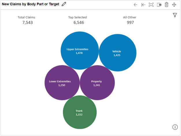
Displays a graphical visualization of the top five body part or target groups based on the count of new claims for the year to date.
Details about the New Claims by Body Part or Target widget
New claims can be identified based on the claim’s:
- Date Opened (default)
- Date of Loss
- Date Claim Reported to Sedgwick
- Date Claim Reported to Client
Hover over a value to view the time frame, body part/target group, number of claims, total incurred for all claims in the category, and the average incurred per claim.
Click a value to drill down to view the claim volume by specific body parts or targets. Click a key performance indicator (Total Claims, Top Selected, and All Other) to view claim volumes by category. Click one of these to drill down further and view individual claim details.
New Claims by Cause
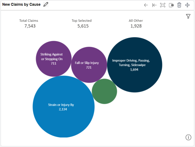
Displays a graphical visualization of the top five causes based on the count of new claims for the year to date.
Details about the New Claims by Cause widget
New claims can be identified based on the claim’s:
- Date Opened (default)
- Date of Loss
- Date Claim Reported to Sedgwick
- Date Claim Reported to Client
Hover over a value to view the time frame, cause group, number of claims, total incurred for all claims in the category, and the average incurred per claim.
Click a value to drill down to view the claim volume by specific cause. Click a key performance indicator (Total Claims, Top Selected, and All Other) to view claim volumes by category. Click one of these to drill down further and view individual claim details.
New Claims by Line and Claim Type
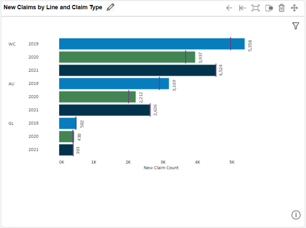
Displays the frequency of new claims (year to date) grouped by line of business. Displays current year, as well as two full years prior. The vertical line depicts claims year to date.
Details about the New Claims by Line and Claim Type widget
New claims can be identified based on the claim’s:
- Date Opened (default)
- Date of Loss
- Date Claim Reported to Sedgwick
- Date Claim Reported to Client
Hover over a value to view the number of new claims for the year; the percentage of those claims that are indemnity claims (WC), bodily injury claims (GL and AU), or contents claims (PR); the current closure rate; the total incurred, average incurred, and total outstanding reserves for all claims in the category; and a bar chart illustrating the categorization of claims by incurred totals (e.g., number of claims with $0k to $2.5k incurred, claims with $2.5k - $10k incurred, etc.).
Click a year to view claim counts for that line of business and year by claim type (for WC claims) or coverage code (for liability claims). Drill down further to view individual claim details.
New Claims by Litigation
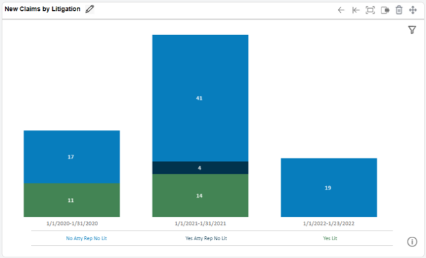
Provides a graphical visualization of the litigation status of new claims, such as the number of claims with no attorney representation and no litigation, claims with representation but no litigation, and claims in litigation.
Details about the New Claims by Litigation widget
Compares the litigation group for three periods of time based on the current year to date, current month, current quarter, or current fiscal year.
New claims can be identified based on the claim’s:
- Date Opened (default)
- Date of Loss
- Date Claim Reported to Sedgwick
- Date Claim Reported to Client
Hover over a value to view the number of claims, time frame, and litigation group.
Click a value to drill down to view the claim volume by state of loss or jurisdiction. Click a state to drill down further and view individual claim details.
New Claims by Nature or Result
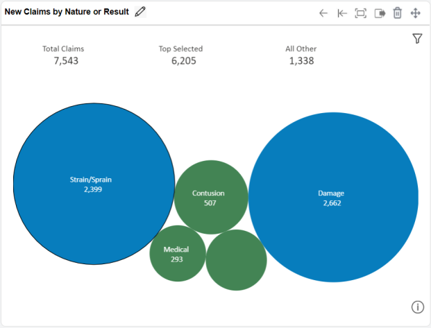
Provides a graphical visualization of the top five groups of nature or result of the injury or loss based on the count of new claims for the year to date.
Details about the New Claims by Nature or Result widget
New claims can be identified based on the claim’s:
- Date Opened (default)
- Date of Loss
- Date Claim Reported to Sedgwick
- Date Claim Reported to Client
Hover over a value to view the time frame, nature or result group, number of claims, total incurred for all claims in the category, and the average incurred per claim.
Click a value to drill down to view the claim volume by specific nature or result. Click a key performance indicator (Total Claims, Top Selected, and All Other) to view claim volumes by category. Click one of these to drill down further and view individual claim details.
New Measure by State
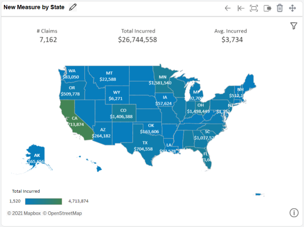
Provides a map visualization that depicts the distribution of new claims by state.
Details about the New Measure by State widget
The image is a heat map of the United States depicting the measure distribution by state of jurisdiction (for workers’ compensation claims) or state of loss (for liability claims). You can specify the measure displayed by this widget from the following options:
- Claim Count (default)
- Total Incurred
- Average Incurred
The “measure” in the widget’s name changes based on the measure selected. Values can be displayed for the year to date or for the current month. New claims can be identified based on the claim’s:
- Date Opened (default)
- Date of Loss
- Date Claim Reported to Sedgwick
- Date Claim Reported to Client
Hover over a value to view values based on the period selected. For year-to-date valuations, the measure for the selected data point from the prior year is displayed, along with the percent change from the prior period for that measure. For current month valuations, the claim count, total incurred, and average incurred per claim is displayed.
Click a value to drill down to view individual claims.
Payment Analysis
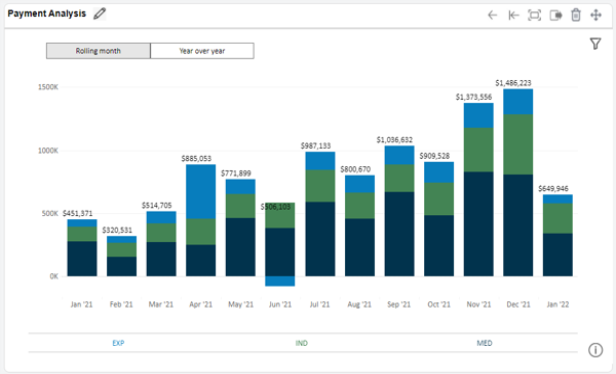
Provides a graphical visualization of the total allocations paid within the period (rolling month or year over year), grouped by pay category (expense, indemnity, loss, or medical).
Details about the Payment Analysis widget
Hover over a value to view the time frame, pay code category, total allocation amount within that category, and claim volume associated with the amount.
Click a value to drill down to view totals by pay code groping within each category. Drill down further to view individual payment details.
Pending Claims
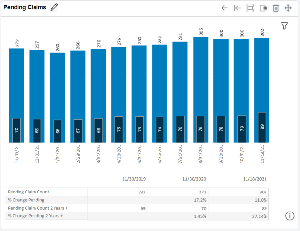
Displays the claims pending (i.e., open) at the end of each period as well as the claims which have been pending for over 2 years.
Details about the Pending Claims widget
Pending claims are identified as have a Claim Status of Open as of the reporting end date.
Additional detail at the bottom of the widget displays the pending claim count and percent in change pending as of the period end in each of the two years prior.
Claims over two years old can be valued based on different duration options:
- Date opened to As Of date (default)
- Date of loss to As Of date
- Date opened to As Of date, excluding closed days
- Date of loss to As Of date, excluding closed days
Hover over a value to view the date, pending claim count as of that date, total incurred for those claims as of that date, and the average incurred per claim.
Click a value to drill down to view individual claims.
Pending Claims by Litigation
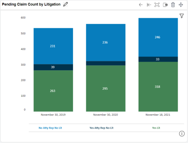
Provides a graphical visualization of the litigation status of pending (open) claims, such as the number of claims with no attorney representation and no litigation, claims with representation but no litigation, and claims in litigation.
Details about the Pending Claims by Litigation widget
Pending claims are identified as have a Claim Status of Open as of the reporting end date.
Three periods are displayed; the right column shows counts of pending claims as of the current date, while the two left columns show counts as of the end of the same month in the two previous years.
Hover over a value to view the date, litigation group, and pending claim count.
Click a value to drill down to view individual claims.
Pending Financials
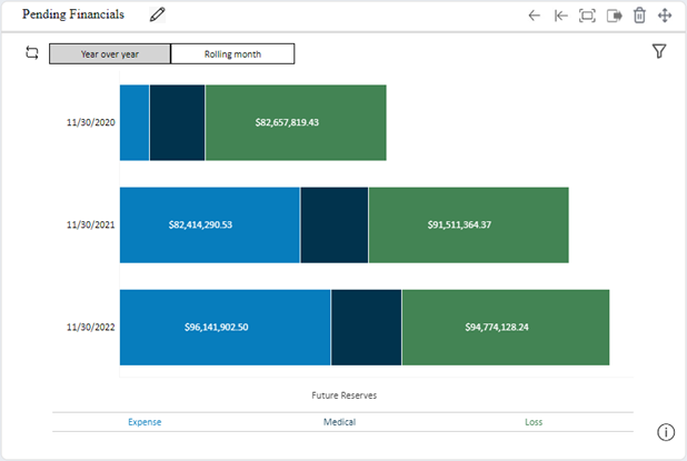
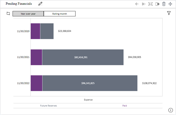
Provides a graphical visualization of the financial breakout of pending (i.e., open) claims based on pay category (expense, indemnity, loss, or medical) or future reserves vs. paid totals for a single pay category.
Two views of this widget are available. The example below shows a year-over-year breakdown of claim future reserve totals by pay category.
The example below shows the year-over-year breakdown of the Expense pay category by future reserve vs. paid values:
Details about the Pending Financials widget
To change the widget’s view, click Switch to a different views near the widget’s top-left corner.
Pending claims are identified as have a Claim Status of Open as of the reporting end date.
You can choose to display values for the year to date or a rolling 13 month period. If you choose the year to date timeframe, the current year (year to date) and past two years (as of the end of the month) are displayed. If you choose the rolling 13 month period, the past 13 months of values are displayed.
For the pay category view, you can also choose to view the total future reserves, incurred, or paid. For the future reserve vs. paid view, you can choose to view values by pay category (indemnity, medical, or expense).
Hover over a value to view the date, value for the pay category in the period, total for all categories in the period, and pending claim count for the period.
Click a value to drill down to view details for individual claims.